Explainer: How climate change is accelerating sea level rise
Sea level rise (SLR) is one of the most severe impacts of climate change, with rising waters threatening to inundate small-island nations and coastal regions by the end of the century.
At the same time, SLR is one of the impacts with the largest uncertainties, with different studies projecting widely different ranges over the 21st century.
The Earth’s oceans have already risen by around 0.2m since the late 1800s, with the rate of SLR accelerating in recent decades. In its 2013 fifth assessment report (AR5), the Intergovernmental Panel on Climate Change (IPCC) estimated that SLR was “unlikely” to exceed 1m this century, even if emissions were very high.
However, a number of studies published in the years since then suggest that the worst-case projections for SLR could be much higher – up to 2m or more this century.
With this week’s release of the IPCC Special Report Ocean and Cryosphere in a Changing Climate (SROCC), it is useful to take a look at the current understanding of how sea level has changed in the past and may change in the future.
In this explainer, Carbon Brief examines estimates of historical sea level rise and the evidence that rates are accelerating. It explores the drivers of historical and future sea level rise, including thermal expansion of water, melting glaciers and melting ice sheets. Finally, it compares the worst-case projections from the IPCC with other studies published before and after AR5 was released.
§ Sea level rise accelerating
Reconstructing past changes in global sea levels is far from a simple task. While high-quality satellite measurements with global coverage are available since the early 1990s, prior to that researchers have to rely on tide gauges scattered around the world.
These tide gauges primarily cover coastal regions, leaving it up to researchers to figure out how best to fill the gaps. Tide gauges are also subject to factors that can complicate the interpretation of local sea level changes, namely subsidence (sinking land) or isostatic rebound (rising land due to melting glaciers).
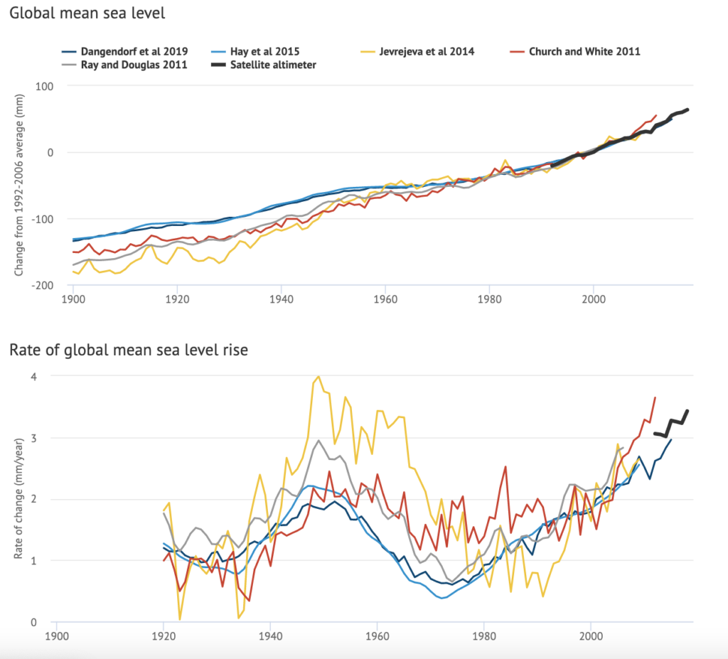
AR5 featured three estimates of global sea level rise: from Church and White, Jevrejeva, and Ray and Douglas. Two additional SLR datasets – Hay and Dangendorf – have been published in recent years. (See the recent Carbon Brief article on the Dangendorf dataset.)
All five of these datasets are shown in the figure below (coloured lines), along with satellite altimeter measurements (in black) after 1993. The top plot shows estimates of global sea level change (in millimetres), while the bottom plot shows the 20-year average rate of change (mm/year).