State of the climate: 2025 close behind 2024 as the hottest start to a year
Global temperatures in the first quarter of 2025 were the second warmest on record, extending a remarkable run of exceptional warmth that began in July 2023.
This is despite weak La Niña conditions during the first two months of the year – which typically result in cooler temperatures.
With temperature data for the first three months of the year now available, Carbon Brief finds that 2025 is very likely to be one of the three warmest years on record.
However, it currently remains unlikely that temperatures in 2025 will set a new annual record.
In addition to near-record warmth, the start of 2025 has seen record-low sea ice cover in the Arctic between January and March – and the second-lowest minimum sea ice extent on record for Antarctica.
§ Second-warmest start to the year
In this quarterly state of the climate assessment, Carbon Brief analyses records from five different research groups that report global surface temperature records: NASA, NOAA, Met Office Hadley Centre/UEA, Berkeley Earth and Copernicus/ECMWF.
The figure below shows the annual temperatures from each of these groups since 1970, along with the average over the first three months of 2025.
(It is worth noting that the first three months may not be representative of the year as a whole, as greater historical warming rates mean that temperatures relative to pre-industrial levels tend to be larger in the northern hemispheric winter months of December, January and February.)
Starting with this state of the climate update, Carbon Brief will be showing a World Meteorological Organization (WMO) aggregate of the five surface temperature records, rather than highlighting any particular one, reflecting a single best-estimate across the different groups.
The WMO aggregate is calculated by averaging the different records using a common 1981-2010 baseline period, before adding in the average warming since the pre-industrial period (1850-1900) across the datasets – NOAA, Hadley, and Berkeley – that extend back to 1850.
The figure below shows how global temperature so far in 2025 (black line) compares to each month in different years since 1940 (with lines coloured by the decade in which they occurred) in the WMO aggregate of surface temperature dataset.
The first three months of 2025 have been unusually warm, coming in in the top-three warmest on record across all the different scientific groups that report on global surface temperatures. This is despite the presence of moderate La Niña conditions in the tropical Pacific, which typically suppress global temperatures.
January 2025 was the warmest January on record in the WMO aggregate, February was the third warmest and March was tied with 2016 as the second warmest.
When combined, the first three months of the year in 2025 were the second-warmest Q1 period in the historical record, just 0.035C below the record set in 2024 after the peak of a strong El Niño event, as shown in the figure below.
The persistence of warmth after the end of the 2023-24 El Niño event – and through a weak La Niña – has been highly unusual by historical standards. In most prior cases, global temperatures returned closer to the long-term temperature trend following the return to neutral El Niño Southern Oscillation (ENSO) conditions in the tropical Pacific.
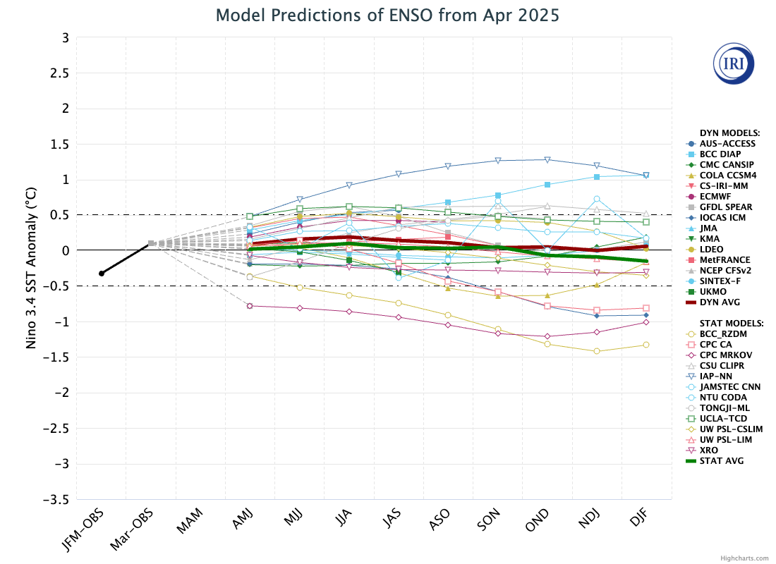
Weak La Niña conditions have faded over the past month, with ENSO-neutral conditions returning and expected to persist for most models through the remainder of the year. However, predictions of ENSO status are particularly uncertain at this time of year due to a phenomenon known as the “spring predictability barrier”.
The figure below shows a range of different forecast models for the ENSO for the rest of this year, produced by different scientific groups. The values shown are sea surface temperature variations in the tropical Pacific – known as the El Niño 3.4 region – for overlapping three-month periods.
§ On track to be a top-three warmest year
By looking at the relationship between the first three months and the annual temperatures for every year since 1970 – as well as ENSO conditions for the first three months of the year and the projected development of El Niño conditions for the remaining nine months – Carbon Brief has created a projection of what the final global average temperature for 2025 will likely be.
The analysis includes the estimated uncertainty in 2025 outcomes, given that temperatures from only the first quarter of the year are available so far.
The chart below shows the expected range of 2025 temperatures using the WMO aggregate – including a best-estimate (red) and year-to-date value (yellow). Temperatures are shown with respect to the pre-industrial baseline period (1850-1900).
Carbon Brief’s projection suggests that 2025 is virtually certain to be one of the top-three warmest years, with a best-estimate approximately equal to global temperatures in 2023.
However, this model assumes that 2025 follows the type of climate patterns seen in the past – patterns that were notably broken in 2023 – and to a lesser extent in 2024. Other recent estimates – such as one published by Berkeley Earth – give a higher probability of around 34% that 2025 will set a new temperature record.
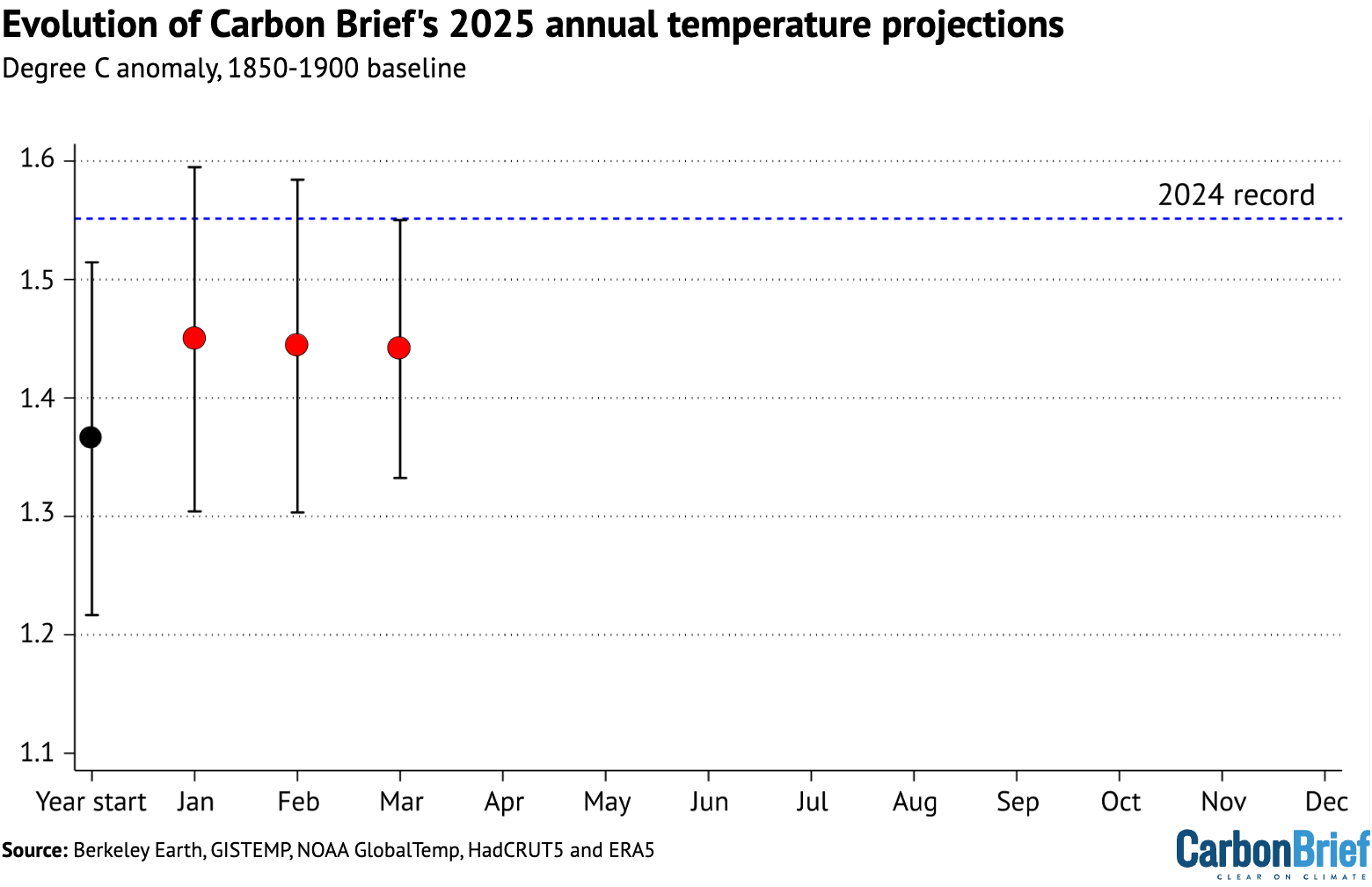
The figure below shows Carbon Brief’s estimate of 2025 temperatures using the WMO aggregate, both at the beginning of the year and once each month’s data has come in. The estimate jumped notably after t2025 saw the warmest January on record, but has been relatively stable over the past three months.
§ Record-low Antarctic and Arctic sea ice
Both Arctic and Antarctic sea ice extent spent much of early 2025 at record, or near-record, lows.
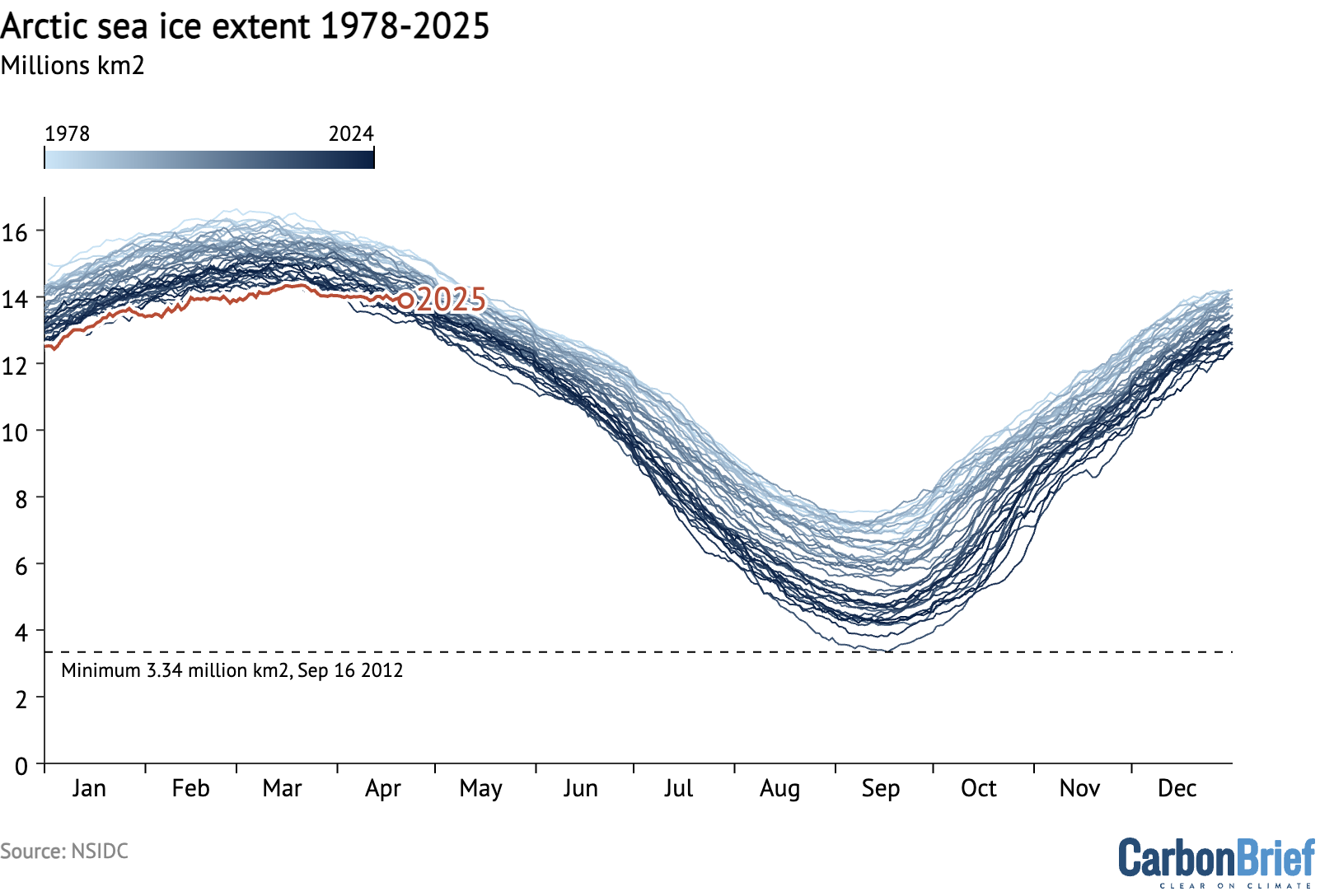
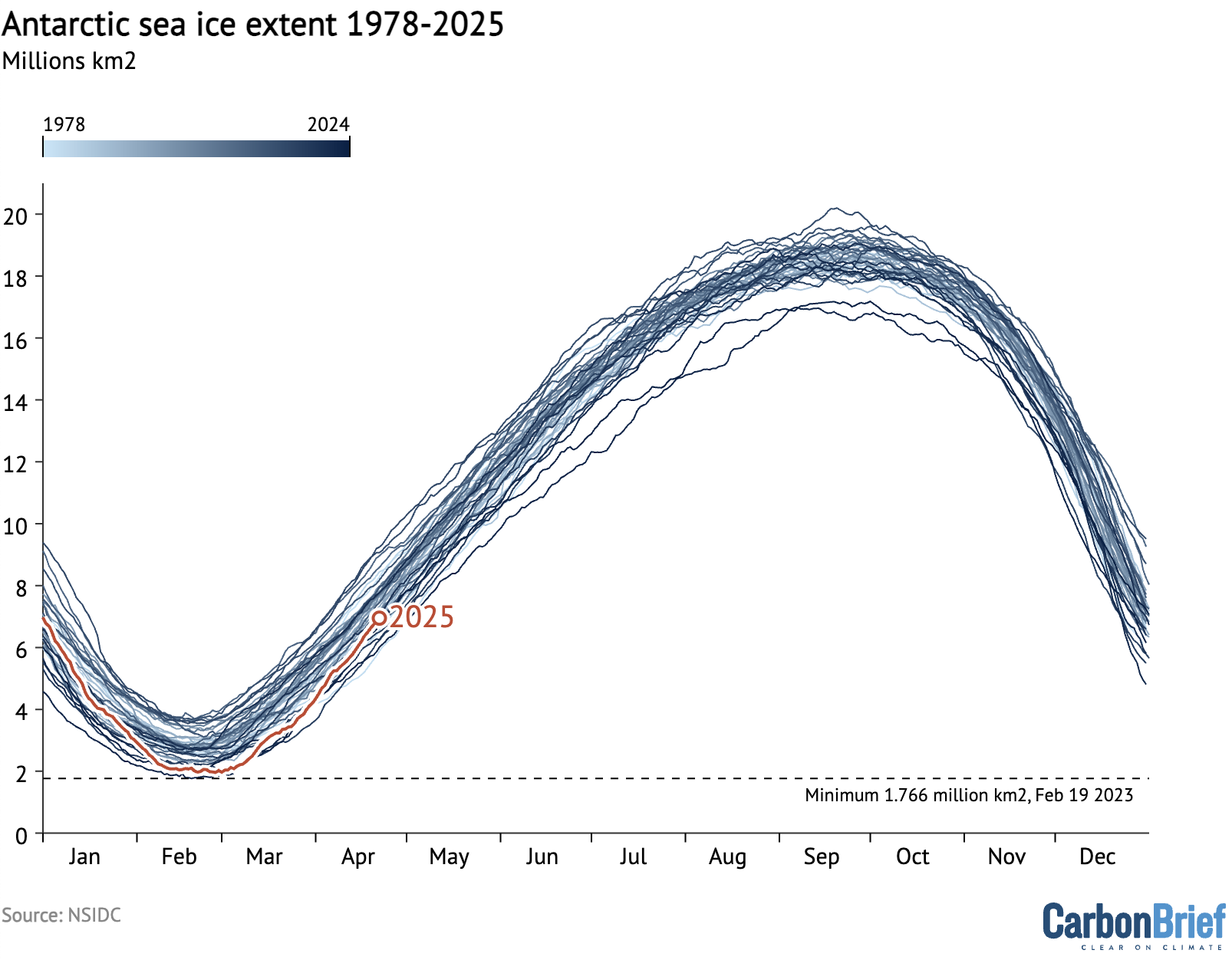
The figure below shows both Arctic and Antarctic sea ice extent in 2025 (solid red and blue lines), the historical range in the record between 1979 and 2010 (shaded areas) and the record lows (dotted black line).
(Unlike global temperature records, which only report monthly averages, sea ice data is collected and updated on a daily basis, allowing sea ice extent to be viewed up to the present.)
Arctic sea ice saw a new record low nearly each day between January and March, recording a record-low winter peak extent in late March. Ice extent subsequently moved out of record-low territory in April.
It is worth noting that, as northern hemisphere winter conditions remain cold enough to refreeze sea ice, there tends to be less variability in extent year-to-year in the winter than in the summer, as the chart below illustrates.
Antarctic sea ice started the year within the historical range (1979-2010), before plunging to tie for the second-lowest minimum on record in late February. It has since recovered in April, and is currently on the low end of the historical range.