Changing the baseline – a look at how we measure Arctic sea ice
Polar scientists at the National Snow and Ice Data Center are changing the way they compare annual fluctuations in Arctic sea ice to the long term average. The new method produces some new graphs, but more importantly it gives scientists more confidence that a downward trend in sea ice exists. We explain why.
Measuring sea ice
Scientists track how the Arctic is changing using a number of methods. Some institutions, like the Polar Science Centre at the University of Washington use satellites and models to track changes in the volume of sea ice. Others, like the National Snow and Ice Data Centre (NSIDC) measure the area of ocean covered in ice – also known as sea ice extent.
Satellite data collected since 1979 shows Arctic sea ice has been declining since records began.
The annual cycle of sea ice retreat and regrowth produces the distinctive sea ice graph curve. The data also allows us to see how each year compares to the long term average – for example indicating if more sea ice has melted than usual.
Changing the baseline
Last month, scientists at NSIDC changed the baseline period which the average is calculated from. Instead of taking a 20 year average, over the period 1979 to 2000, the new baseline looks at the 30 years from 1981-2010.
There are two benefits of switching to a 30 year average. For one, many other scientific institutions use this time frame as a baseline for measuring changes in Arctic sea ice, so the switch makes it easier to compare trends across different data sets. The other advantage is that a longer time frame further smooths out the effect of natural fluctuations in sea ice which can affect melting on shorter timescales.
A new average
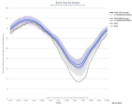
The graph below shows what the change in baseline means in practical terms:
The solid blue line is the old long term average – 1979-2000 – in sea ice extent. The shaded blue area around this line shows the two standard deviation range. If you plotted sea ice extent measurements for every day over that time period, 95 per cent of the data would fall within that range.
In solid grey is the new average for sea ice extent. You can see that since sea ice has shrunk in recent years, the new average is lower. The shaded area around that average is also bigger than it was for the old average. That’s because a lot of sea ice measurements collected in the last ten years fall below the long term average.
2012 saw the lowest Arctic sea ice extent since records began in 1979. You can see from the graph that it fell well below the new 30 year baseline. But relative to the older 20 year baseline, 2012 looked much more of an outlier.
Less extreme, but clearer trends
One consequence of the change is that there’s now less difference between current ice levels and the updated, lower, long term average.
NSIDC explains that even though the record lows may look less visually impressive against the new baseline, they actually show more clearly that a long term decline is happening. Extending the average means that factors which affect sea ice over short time periods can be excluded as possible causes of the long term decline scientists are seeing.
For example, changes to the Arctic Oscillation, and big El Nino events, can make sea ice melt more or less from one year to the next. In some cases the effect lasts a number of years. But over three decades, these natural fluctuations even out.
Ultimately, it’s this long term trend which matters the most, and it can still be seen whichever baseline is used. According to research scientist, Walt Meier:
“Whatever reference is used, the essential scientific conclusions are the same: there is still a very strong decline in Arctic sea ice, particularly during summer”